Make an EPUB look good on a phone: 5 checks
A phone reader must be able to change the type size, font, margins, and theme. A good EPUB supplies structure and then gets out of the way. Fixed widths, forced colours, and layout made from spaces will break as soon as the reader changes one setting. If you only read the book, try the reading app first: Apple Books and Google Play Books both let you change the font, text size and theme. If those settings change nothing, the file forces its own styles, and the five checks below are for whoever makes the EPUB.
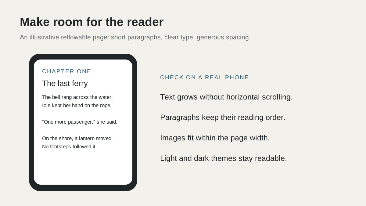
Fix an EPUB that looks wrong on a phone: real chapter headings, CSS that reflows, images that fit, a dark mode that works, and a test in two readers.
Build real chapter structure
Create one XHTML file for each chapter or stable section. Use one h1 heading for the chapter title, p elements for paragraphs, and hr or a semantic scene-break element for a scene change. Do not make indentation with repeated spaces or empty paragraphs.
Add the EPUB navigation document and list every chapter in reading order. Give the book a language, title, author, identifier, and cover in the package metadata. A reader uses this data for its library view, table of contents, search, and accessibility features.
- Use UTF-8 text and valid XHTML.
- Keep chapter file names stable and simple.
- Use heading levels in order.
- Give meaningful images useful alternative text.
Use CSS that can reflow
Set text sizes in rem or em units. Use a unitless line-height, usually near 1.5 for body text, and modest paragraph spacing. Avoid fixed pixel widths, absolute positioning, and a forced page height.
Do not set a white page background with black text. That can make the book unreadable in night mode. Use the reader defaults for body text and background unless a specific element needs a colour. Do not force a custom font for the complete novel.
Keep the main stylesheet small. Ebook readers support a practical subset of web CSS, and complex selectors are difficult to test. A plain document survives more reading apps than a design copied from a marketing website.
Prepare images for a small screen
Compress photographs and illustrations before packaging them. Set max-width to 100 percent and height to auto so an image fits portrait and landscape screens. Keep the source aspect ratio.
Put a full-page illustration in its own section when it should stand alone. For an image inside a chapter, place the caption next to the image and keep both in the same reading order. Test every image at a large text setting because the surrounding text can move to a new screen.
Test the file as a reader would
Run EPUBCheck, then open the file in at least two reading engines. Test Apple Books or Google Play Books on a phone and Thorium or another standards-based reader on a computer. If the target store has its own preview tool, test there too.
Change the font size to the smallest and largest useful settings. Switch between light and dark themes. Rotate the phone. Use the table of contents, tap internal links, search for a phrase, and move across the final chapter boundary. Check that the cover and metadata look correct in the library.
A validator catches broken package files and links. It cannot tell you that a chapter starts with an orphaned heading or that an illustration is too small. Use both automated validation and a real reading pass.
Keep mobile paragraph rhythm without copying raw line breaks
A current r/noveltranslations discussion shows that readers do not agree on very short web-novel paragraphs. Some readers find one sentence per line fast and comfortable on a phone. Others find the uniform blocks hard to follow and prefer natural English paragraph groups.
Keep dialogue turns separate and avoid large walls of text, but do not turn every sentence into its own paragraph automatically. Test the chapter at the normal phone width. Group sentences that describe one action or idea, and keep short paragraphs where pace or dialogue needs them.